


Artwork Preparation Guide: How to Prepare Files for Professional Printing
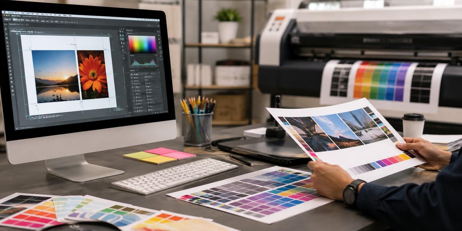
A strong design can still produce disappointing printed results if the artwork file is not prepared correctly.
Images may appear blurry. Important text can sit too close to a trimmed edge. Colours may look different from what was expected on screen, while missing bleed can leave unintended white borders after cutting. Fonts, transparency and incorrectly prepared dielines can create additional production problems.
This is why artwork preparation for printing is an important stage of professional print production.
This guide covers artwork preparation, file formats, colour modes, bleed and margins, image resolution, common errors and a practical final checklist businesses can use before submitting files for professional printing.
Preparing Artwork
Professional artwork preparation should begin before the final design is completed.
The first step is understanding what will actually be produced.
Confirm the Final Size
Artwork should be created according to the intended finished dimensions.
For example, if a business needs a particular label size, brochure format or business card dimension, the artwork should be designed around that specification from the beginning.
Simply creating a design at an arbitrary size and resizing it immediately before printing can create problems with:
- Image resolution
- Text size
- Line thickness
- Bleed
- Margins
- Proportions
This becomes particularly important for packaging, labels and die cut materials where the printed dimensions must fit a physical object.
Ask for Printer Specifications Early
Different printing companies, equipment and finishing processes can have different artwork requirements.
Before completing the design, confirm specifications such as:
- Final dimensions
- Required bleed
- Preferred file format
- Colour mode
- Image resolution
- Dieline requirements
- Finishing requirements
- Font handling
This is safer than assuming one set of technical specifications will work for every printer.
Design at Actual Size
Where practical, prepare artwork at its final production size.
This makes it easier to evaluate:
- Font readability
- Image quality
- Margins
- Logo proportions
- Barcode dimensions
- QR code dimensions
A label that looks spacious when enlarged on a monitor can become difficult to read when printed at its actual size.
Separate Production Elements
Some commercial printing projects require additional production information beyond the visible artwork.
These can include:
- Die-cut lines
- Fold lines
- Foil areas
- Spot UV areas
- White ink layers
- Embossing areas
These elements should normally be clearly identified according to the printer’s specifications.
Do not simply place production lines into the artwork without confirming how the printing company expects them to be supplied.
File Formats
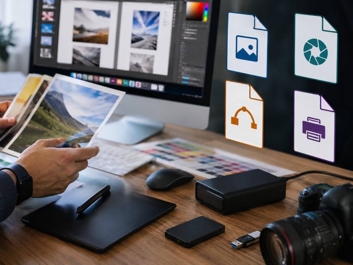
Choosing an appropriate file format helps preserve artwork quality and makes files easier to process during pre-press.
PDF is one of the most commonly used formats for professional printing because it can preserve:
- Page dimensions
- Fonts
- Vector graphics
- Images
- Colour information
- Bleed
A properly exported print-ready PDF can provide a more reliable production file than sending an editable document created in general office software.
However, not every PDF is automatically print-ready.
A PDF containing low-resolution images, incorrect colours or missing bleed still contains those problems.
Adobe Illustrator
Adobe Illustrator files may be used for artwork containing:
- Vector logos
- Illustrations
- Labels
- Packaging
- Die-cut designs
AI files can preserve editable vector elements.
If an editable source file is requested, businesses should ensure that linked images and fonts are handled according to the printer’s instructions.
EPS
EPS is another format traditionally used for vector graphics and logos.
Vector files are useful because shapes and text outlines can generally be scaled without becoming pixelated in the way raster images do.
TIFF
TIFF files can be useful for high-quality raster images.
They can preserve substantial image information and are commonly associated with professional image workflows.
However, a TIFF is still resolution-dependent. Enlarging a small raster image beyond its appropriate dimensions can reduce print quality.
JPEG
JPEG can be used for photographic images, but compression and resolution need attention.
Repeatedly saving and compressing JPEG files can reduce image quality.
A small JPEG copied from a website is generally not a suitable replacement for the original high-resolution image.
Vector vs Raster Files
Understanding this distinction is useful for artwork preparation for printing.
Vector graphics are constructed using mathematical paths. They can usually be scaled significantly without losing edge sharpness.
Common vector elements include:
- Logos
- Icons
- Illustrations
- Typography converted appropriately
Raster images are made from pixels.
Examples include:
- Photographs
- JPEG images
- Many PNG files
Raster images have a fixed pixel resolution, meaning enlargement can eventually make them appear blurry or pixelated.
For logos and line artwork, vector files are generally preferable where available.
Colour Modes
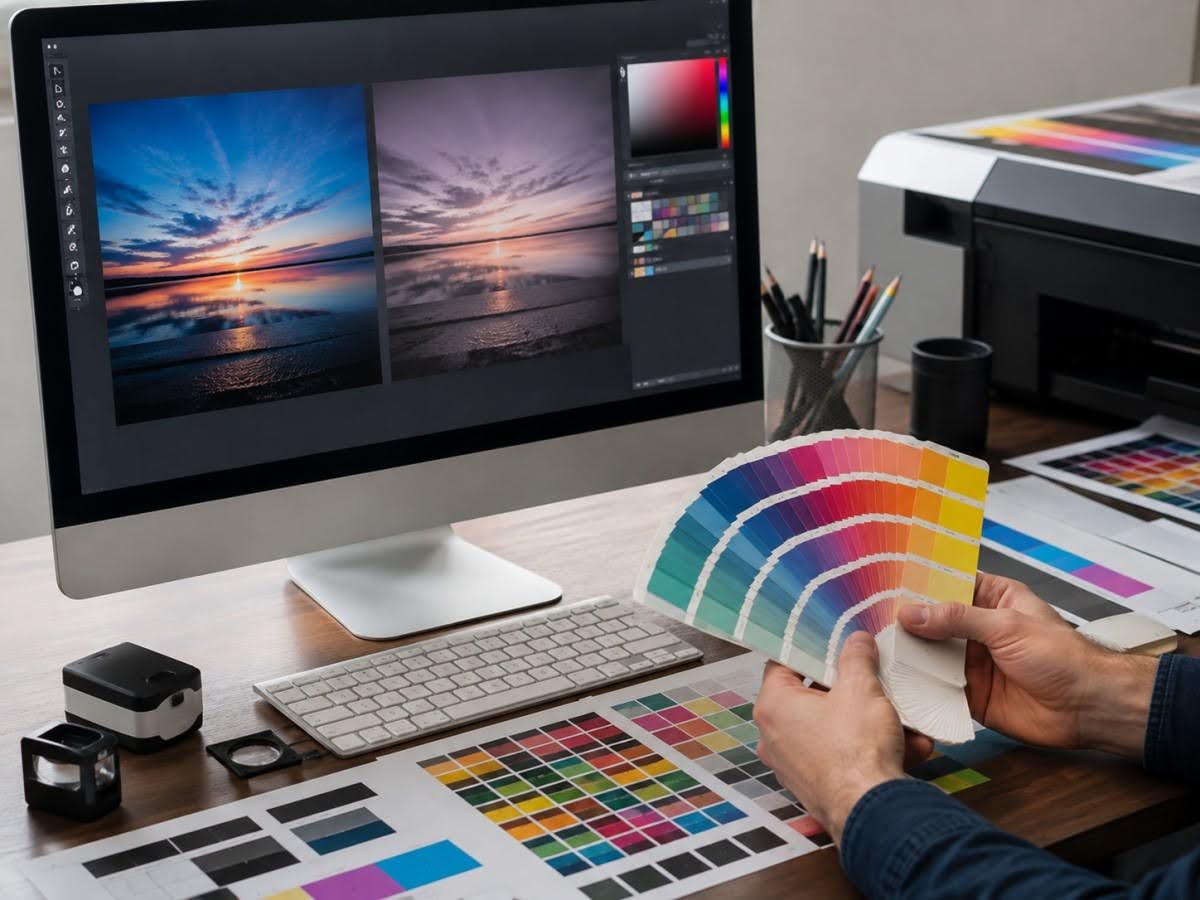
Colour is one of the areas where screen expectations and printed output can differ.
RGB
Digital screens commonly display colours using RGB:
- Red
- Green
- Blue
RGB creates colour using emitted light.
Websites, social media graphics and other screen-based content are commonly designed in RGB.
CMYK
Commercial printing frequently uses CMYK:
- Cyan
- Magenta
- Yellow
- Key/Black
Instead of emitting light, printed colour is produced using ink or toner on a physical substrate.
This fundamental difference means some bright RGB colours cannot be reproduced identically in standard CMYK printing.
Why RGB-to-CMYK Conversion Matters
A design may look extremely bright on a monitor but appear different after conversion for print.
Particularly vivid:
- Blues
- Greens
- Oranges
- Neon-like colours
can shift because the reproducible colour ranges are different.
Businesses should therefore avoid treating a screen preview as an exact representation of the finished printed colour.
Colour Profiles
Colour profiles help define how colours should be interpreted by different devices and production workflows.
The appropriate profile depends on factors such as:
- Printing technology
- Printer requirements
- Paper or substrate
- Production standards
Rather than assigning a random CMYK profile, designers should follow the printing company’s requested specifications.
Brand Colours
Businesses with strict corporate colours should discuss them with the printer before production.
Depending on the printing method, brand colour management may involve:
- CMYK values
- Spot colours
- Physical proofs
- Colour references
If colour accuracy is particularly important, relying solely on an uncalibrated computer monitor can create unrealistic expectations.
Rich Black vs Standard Black
Designers may encounter different approaches to producing black in print.
Small black text is often handled differently from large solid black areas.
The appropriate ink combination depends on the printing process and printer specifications.
Businesses should therefore avoid applying arbitrary “rich black” formulas without confirming production requirements.
Bleed & Margins
Bleed and safe margins are fundamental concepts in print-ready artwork.
They account for the fact that physical printed pieces are trimmed after printing.
What Is Bleed?
Bleed is artwork that extends beyond the final trim edge.
Imagine a brochure with a blue background that should reach completely to the edge.
If the blue background stops exactly at the trim line, tiny cutting variations could leave a visible white strip.
Instead, the background extends beyond the trim area.
After trimming, the colour reaches the edge cleanly.
How Much Bleed Is Needed?
There is no reason to guess.
Bleed requirements can vary according to the printer and product, so businesses should confirm the required measurement with the printing company.
The principle remains the same:
Any background image, colour or graphic intended to reach the edge should extend into the specified bleed area.
What Is a Safe Margin?
The safe margin works in the opposite direction.
Important content should remain sufficiently inside the trim edge.
This includes:
- Text
- Logos
- Phone numbers
- QR codes
- Barcodes
- Important graphics
Placing essential elements too close to the edge can make the design look cramped and create a greater risk of content being affected by trimming.
Bleed vs Safe Area
A useful way to understand the difference is:
Bleed = extends outside the trim line.
Safe area = keeps important information inside the trim line.
Both are necessary for professionally prepared artwork.
What Are Crop Marks?
Crop marks indicate where the printed piece should be trimmed.
They can be useful during print production, but businesses should follow the printer’s export requirements rather than adding them automatically.
Some printing workflows request crop marks, while others prefer files without them because the production system generates its own marks.
Packaging and Label Dielines
Packaging and custom labels may require more complex production guides.
A dieline can identify:
- Cut edges
- Folds
- Creases
- Perforations
- Other structural features
Important artwork should be positioned according to these structural elements.
For example, placing a product name directly across a fold could reduce readability after the packaging is assembled.
Resolution
Image resolution has a major influence on print quality.
What Is Printing Resolution?
Raster image resolution is commonly expressed in pixels per inch (PPI), although DPI is also frequently used conversationally in printing contexts.
A digital image contains a fixed number of pixels.
When the image is enlarged, those pixels need to cover a larger physical area.
If enlarged too far, the image may appear:
- Pixelated
- Soft
- Blurry
Why Website Images Often Print Poorly
Images displayed online are generally optimised for screens and file size.
A small website image may look perfectly clear on a monitor but contain insufficient pixel information for a large printed brochure or poster.
Businesses should therefore retain original high-resolution photography and design assets.
Downloading an image from the company’s own website is not necessarily equivalent to using the original file.
Common Resolution Targets
For many conventional commercial print applications, approximately 300 PPI at the final printed size is a commonly used target for photographic imagery.
However, this is not a universal rule.
Required resolution depends on:
- Printing process
- Viewing distance
- Final dimensions
- Image type
- Printer specifications
Large-format graphics viewed from several metres away may not require the same effective resolution as a small premium brochure viewed closely.
Effective Resolution Matters
A common mistake is checking the image’s original resolution without considering how much it has been enlarged.
Suppose an image is suitable at one size but is enlarged to twice its dimensions in the layout.
Its effective resolution decreases.
Designers should therefore evaluate resolution at the actual size used in the final artwork.
Vector Artwork Avoids Resolution Problems
Logos, icons and line graphics should ideally be available as vector artwork where possible.
Vector graphics remain sharp when resized because they are not built from a fixed pixel grid.
This is particularly important when the same logo may appear on:
- Business cards
- Brochures
- Packaging
- Posters
- Large displays
Common Errors
Many printing problems can be traced back to a relatively small number of artwork preparation mistakes.
Using Low-Resolution Images
This can produce blurry or pixelated printed images.
Whenever possible, use original high-resolution assets rather than images copied from websites, messaging applications or screenshots.
Designing Only in RGB
Artwork intended for print may change visually when converted from RGB to the production colour space.
Colour planning should happen before final approval rather than after printing.
Missing Bleed
If backgrounds stop exactly at the trim line, cutting variation can reveal unintended white edges.
Extend edge-to-edge artwork according to the printer’s bleed specifications.
Text Too Close to the Edge
Important information placed near trim lines can look poorly balanced or risk being cut.
Keep essential content inside the specified safe area.
Incorrect Document Size
Submitting artwork at the wrong dimensions can create scaling problems.
Always confirm the final size before design begins.
Missing Fonts
If editable files are supplied without required fonts, text may display incorrectly when opened elsewhere.
Depending on the workflow, fonts may need to be:
- Embedded
- Packaged
- Converted appropriately
Follow the printer’s instructions.
Using Screenshots for Logos
A screenshot is a raster image and may have limited resolution.
Businesses should retain original vector logo files for professional printing.
Incorrect Dielines
Packaging, labels and custom die-cut materials may require precise cut paths.
Changing dielines without understanding the production requirements can cause serious fitting or cutting problems.
Use the printer’s approved template where one is provided.
Forgetting Finishing Layers
Foil, spot UV, embossing and other specialty finishes may require separate production artwork.
If those elements are not clearly prepared, production may be delayed while corrected files are requested.
Overlooking Small Text
Artwork is often reviewed while heavily zoomed in.
This can make tiny text appear more readable than it will be in print.
Review the design at actual physical size whenever possible.
Failing to Test QR Codes and Barcodes
A QR code that works on a computer screen may not necessarily perform identically after resizing, printing or finishing.
Before approving production:
- Scan QR codes
- Verify barcodes
- Check contrast
- Check dimensions
- Consider final placement
Operational elements should be tested, not assumed.
Final Checklist
Before submitting print-ready artwork, businesses can use the following checklist.
Document Setup
- Is the artwork at the correct final size?
- Has the printer’s template been used where required?
- Is the document orientation correct?
Colour
- Is the artwork using the required colour mode?
- Have RGB-to-print colour changes been reviewed?
- Are important brand colours specified correctly?
- Has the printer’s required colour profile been followed?
Images
- Are images sufficiently high resolution at their final printed size?
- Are original images being used instead of website copies or screenshots?
- Are logos supplied as vector files where possible?
Bleed and Margins
- Has the required bleed been added?
- Do background images and colours extend into the bleed?
- Is important text inside the safe area?
- Are crop marks included only if requested?
Fonts and Text
- Are all fonts embedded, packaged or otherwise prepared as requested?
- Has all text been proofread?
- Are font sizes readable at the final printed dimensions?
Production Elements
For packaging, labels or premium finishing, check whether the file contains properly prepared:
- Dielines
- Fold lines
- Foil areas
- Spot UV areas
- Embossing areas
- White ink layers
These should follow the printer’s production requirements.
Functional Checks
- Do QR codes scan?
- Are barcodes readable?
- Are telephone numbers correct?
- Do website addresses work?
- Are product details current?
Final Export
- Is the correct file format being supplied?
- Is the PDF exported using the requested settings?
- Are bleed settings correct?
- Are unwanted guides or non-printing elements removed?
- Is the final filename clearly identified?
A final technical check before submission can prevent much more expensive corrections after printing begins.
Frequently Asked Questions (FAQs)
What does print-ready artwork mean?
Print-ready artwork is a production file prepared according to the printer’s technical requirements, including dimensions, colour mode, bleed, image resolution, fonts and any necessary finishing information.
What file format is best for professional printing?
PDF is commonly used for professional printing because it can preserve page dimensions, fonts, vector graphics and images. However, the printing company should confirm its preferred file format and export settings.
Should printing artwork be CMYK or RGB?
Commercial printing commonly uses CMYK or other defined print colour systems, while RGB is primarily used for screens. Businesses should follow the colour specifications provided by their printer.
Why do printed colours look different from my screen?
Screens create colours using light, while printing uses ink or toner on physical materials. Screen calibration, colour profiles, printing technology, ink and paper can all influence the difference.
What is bleeding in printing?
Bleed is additional artwork extending beyond the final trim edge. It helps prevent unintended white borders when backgrounds or images are meant to reach the edge of the printed piece.
Do I need crop marks?
It depends on the printer’s production workflow. Some printing companies request crop marks, while others generate their own. Confirm the requirement before exporting artwork.
What resolution should images be for printing?
Approximately 300 PPI at final size is a common target for many commercial print applications, but requirements vary according to printing process, size and viewing distance. Follow the printer’s specifications.
Why should logos be supplied as vector files?
Vector logos can generally be resized without becoming pixelated, making them suitable for applications ranging from business cards to large-format printing.
Can I use images downloaded from my website?
They may not contain enough resolution for professional printing. Original high-resolution image files are generally preferable.
What is a safe margin in printing?
A safe margin is the area inside the trim line where important text, logos and other essential elements should remain to reduce the risk of trimming problems.
Do die-cut labels require special artwork?
Usually, yes. Custom die-cut labels may require a defined cut path or dieline prepared according to the printer’s specifications.
Does foil or spot UV require separate artwork?
Often, yes. Specialty finishing areas may need to be identified separately from the standard printed artwork. Requirements vary by production workflow.
Should QR codes be tested before printing?
Yes. QR codes should be tested at their final intended size and, where possible, after proofing to ensure they remain reliably scannable.
Can a printing company fix artwork problems?
Some printing companies may provide artwork assistance, but businesses should not assume extensive design correction is included. Confirm available artwork services and associated costs before production.
Send Better Files, Get Better Print Results
Professional print quality starts before the printing machine begins production. Correct dimensions, colour settings, bleed, resolution and production information give the printer a stronger foundation for producing the intended result.
For businesses that need guidance on artwork preparation for printing or print-ready files for labels, brochures, packaging and other commercial printing projects, Printsys Pte Ltd can advise on artwork specifications and production requirements before printing begins. Get in touch with Printsys today!